EVERY BRAND HAS A STORY
 View Detail
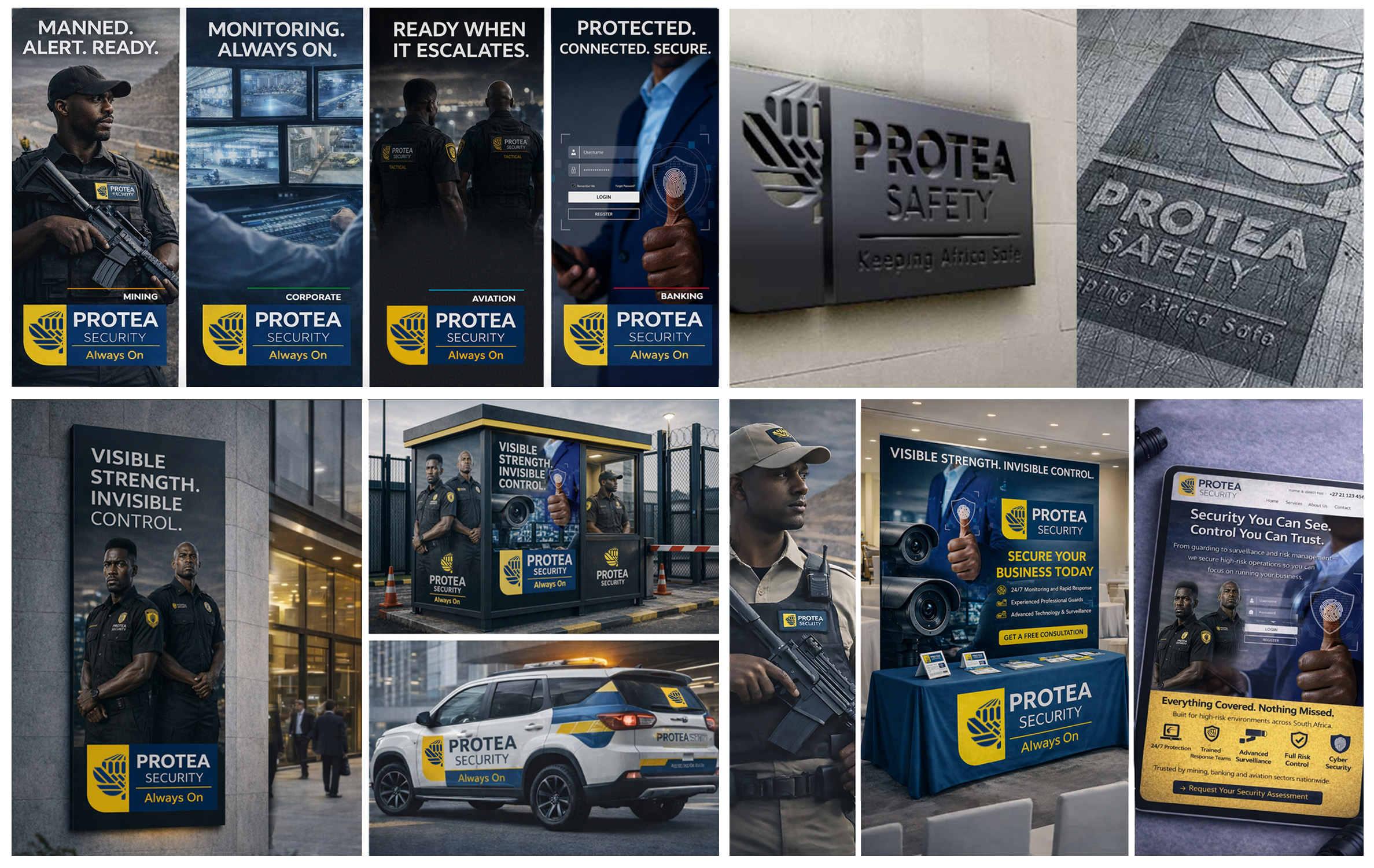
Branding Project The Protea Safety branding was developed to deliver a strong, serious and authoritative presence. The client required a concept that communicates strength, control and reliability through bold visuals and clear direction with a hint of South Africa. The …
 View Detail
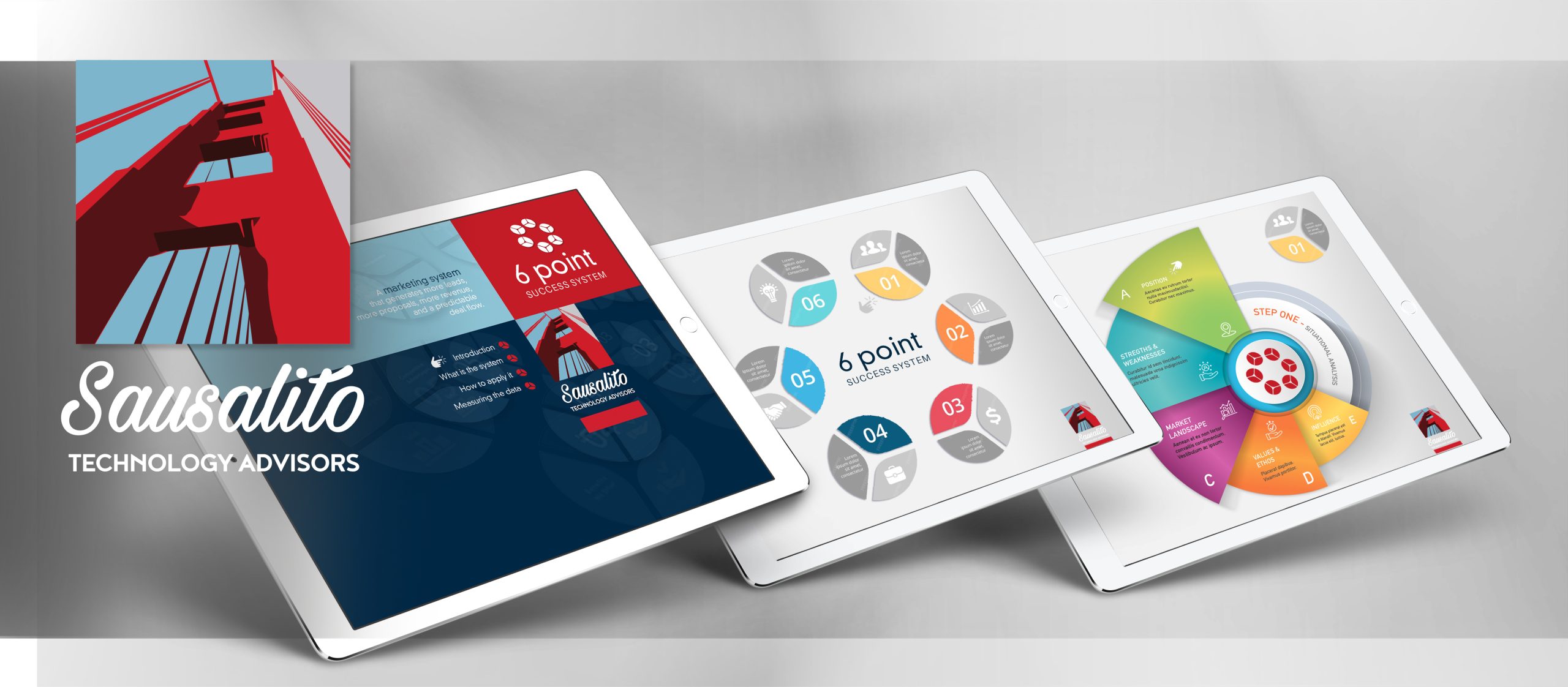
Digital Ebook The client required a way to translate a written 6-point system into a simple, impactful visual interpretation. The solution was to create a visual 6-point system icon to structure the content into a clear, visual framework, using diagrams …
 View Detail
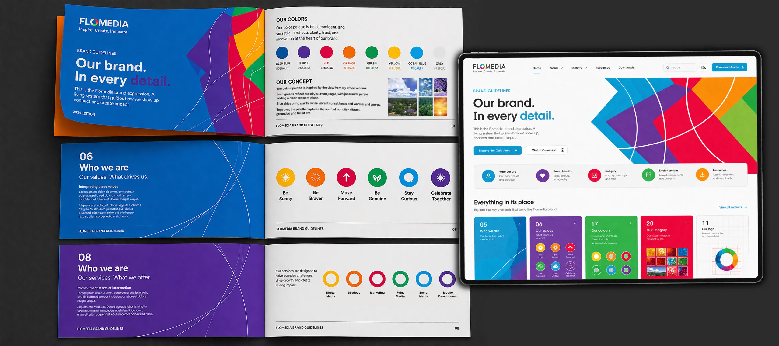
Corporate Identity The CI is built around a simple, authentic idea – the view from the office window. The colour palette draws directly from this environment: lush urban greens, jacaranda purple, clear blue skies and warm sunset tones. Together, these …